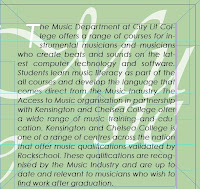
First of all, because the size of the document is so big; I created grids and numbered the different sections. I have never worked with such a big size documents; however I am used to working with multiples pages.

Just experimenting so far with different subjects backgrounds.

This is the subject's introduction text; the subject is on the background; Vivaldi typeface at 30% opacity.

This one, the text has an opacity of 70% and I think it is more legible. I am not sure yet however if it is empowering the text too much?

I have altered the layout from "portrait" to "landscape" so I have had to rearrange a couple of things. At this stage it is not too bad to have changed the layout since there is barely anything on the page.

No comments:
Post a Comment