A few examples:
- Nunavut
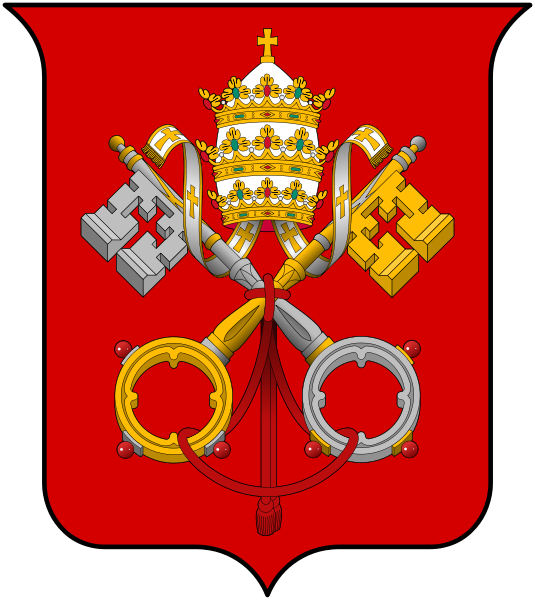
- The Vatican
- Bahamas

We formed a group to create our own Coat of Arms. Both myself and Ewa live near Askew Road.
Askew Road, W12 is a long mainly residential road, linking Shepherds Bush to East Acton.

This symbolises Askew Road, linking Goldhawk Road and Uxbridge Road.

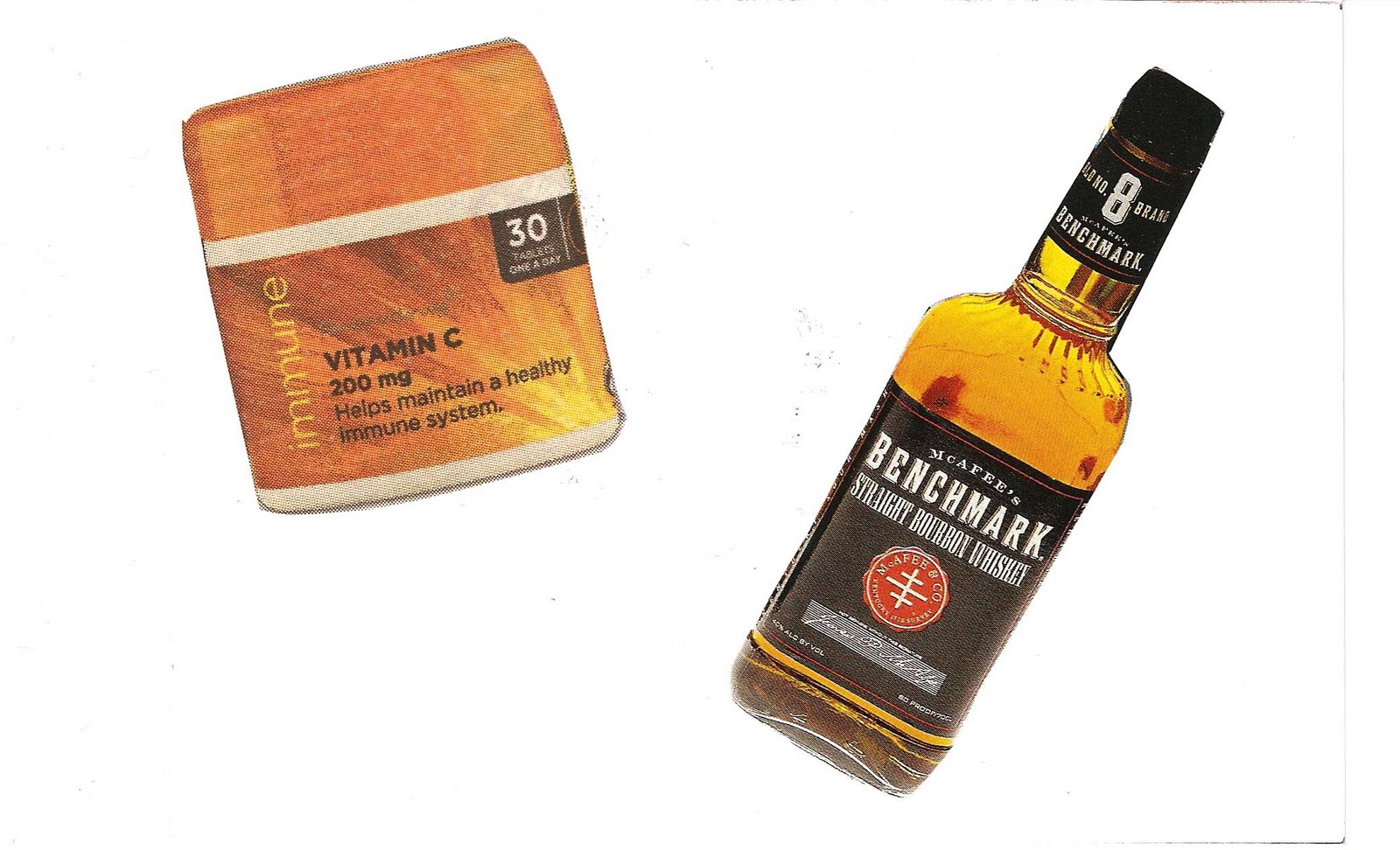
This road has a Chinese Take Away, A funeral Home, A pub called the Orchard another called Angel (hence the snake...Adam & Eve... a bit far fetched...but hey!)

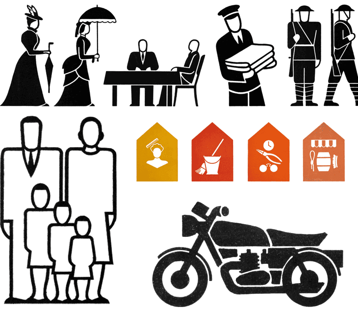
This is our final design.
The chinese take away box has become the crest and the postcode has been made up of iconic symbols representing Askew Road.


