29 March 2010
Easter Holidays...Yeah...
Unfortunately it has not been Yeah for me, I have been really unwell over the last week, althought I am not 100% well, I still feel much much better, at least I am able to get up without my whole body aching...so this week I need to carry on with the Collage Extension Project as well as the Timeline.
17 March 2010
So much to do...
Yeah, it is the end of term!! Well not quite officially, really it will be on Friday. I have handed in my Zerofee Poster, which I think I am quite happyish with it...There is still some alterations to do if I wanted it to be perfectly perfect, but overall it's not too bad. Probably, I think one of my "best" so far since starting the FdA.
We have 4 weeks off, but it will not be really holiday as I have a lot to do:
- Portfolio - Rectify and send off to prospective work placements
- Timeline
- Collage Extension
15 March 2010
Zerofee - Project - Dutch Posters 1960-1996
I found this book of a great inspiration, I've made quite a few notes and taken quite a few pictures, but I'm only gonna put a few of my favourites.
This poster is very strong. It only uses 2 contrasting colours as well as black and white pictures.
This is an ad for Nike, however, it is portrayed at being more like a theatre poster with words/phrases such as "An Opera by Nike", starring, a story.
I like its effectiveness/efficient simplicity. Personally, I am not sure I would have used opacities of red. Many colours will work really well at different opacities, but I have noticed from experience that red tends to fade into orange/pink rather than being of a lighter shade.
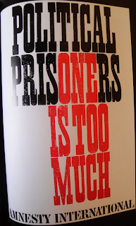
Typographic poster that works with its simplicity. Straight to the point.
10 March 2010
Really Good Example of Typographic Posters
Just came accross this really good website...it will be good to go back to it from time to time for inspiration and reference...this is a great source for inspiration, it is not just about typography, here is some more sample.
01 March 2010
Workshops - Book Binding
This workshop was great fun to do, not to mention very handy to know. I made a book last year for one of my projects and I had no idea how to bind it...now I can!
The workshop covered two ways to bind, firstly by stitching (which was surprisingly easy - especially since sewing is not one of my strengths...) and by using the binding machine. It is basically gluing pages.
First of all, we put together 10 pages, which we subsequently folded.
Once all the pages were stitched together, we put the covers.
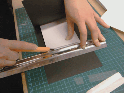
The cover will need to be trimmed to size.
Nearly ready to go!
Subscribe to:
Posts (Atom)


