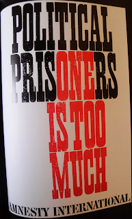
I found this book of a great inspiration, I've made quite a few notes and taken quite a few pictures, but I'm only gonna put a few of my favourites.
This poster is very strong. It only uses 2 contrasting colours as well as black and white pictures.
This is an ad for Nike, however, it is portrayed at being more like a theatre poster with words/phrases such as "An Opera by Nike", starring, a story.
I like its effectiveness/efficient simplicity. Personally, I am not sure I would have used opacities of red. Many colours will work really well at different opacities, but I have noticed from experience that red tends to fade into orange/pink rather than being of a lighter shade.
Typographic poster that works with its simplicity. Straight to the point.
Subscribe to:
Post Comments (Atom)


No comments:
Post a Comment