26 February 2010

Zerofee - Project - Identifying my social issue

I have decided to chose the Housing Crisis as the theme of my poster.
I am currently reading through articles about the crisis itself but also legislation documents.
Having some statistic and numbers on the poster will help to give it more impact.  The audience needs to be shocked to take any notice and therefore act.
I have discussed that unfortunately the general public is unable to directly change things and more particularly the current housing legislation.  However, the public have the power to get in touch with their MPs/ councils to request a change in this legislation, updating it as currently the definition of overcrowding dates from 1935.

21 February 2010

Experimenting a little...

again...although I may say this is definitely an example of how you can loose track of the purpose of your image manipulation by applying just about everything and anything on an image.  I put two pictures together, copied the second one quite a few times, applying different blending modes, playing with Hue...etc.  In the end I had a lot of different effects that they could not be indivually seen so I starting merging them one by one until I only one remained... 


Quite happy with the last one, although I think I could do some further work on the type and colours.  The background is quite dark and busy so I found it quite hard to make the text stand out...

Workshops - IT - Helvetica Remixed

Last Tuesday, as part of an IT Workshop, we had to "remix" Helvetica using Illustrator. My letter was "w". The session was 21/2 hours at the end of which our letter was to be given to Jo. She compiled all of the letters and made a book out of it, published on Isuu.

I just saw it today and it is pretty good...although mine, not sure exactly what happened but it is not exactly as I had given it to Jo...did I give her the wrong version...possibly. Hopefully, if it isn't too much hassle for her she will be able to change it...pretty please...!

Anyway, this is what I did...


I have really enjoyed doing this and definitely carry on experimenting...
That was fun and I am sure this skill will prove very useful in the future. Thanks Jo. Looking foward to more workshop with you although I know I should not just rely on the college, I need to experiment and learn of my own initiative.
18 February 2010

Experimenting a little...

Just thought I'd open up Photoshop (and a picture) and play with it a bit...

From this...


To this...


I mainly changed the Hue and Saturation then put all different outcomes together


Had a really good day today...

...and thought I'd share it.... It's been such a long time since I felt this way since going @ LCC. The last few weeks after Christmas have sort of been manic and... a bit disappointing even. Lately, in fact since starting @ LCC I have not felt I have produced "good design". It's as if I have totally become "rubbish" and really been wondering what is it I have been doing since October...?! I feel design wise I have reached a plateau. This morning I was just looking through a few things I did last year and it reminded me why I came here in the first place... Yes because I like creating things, having fun even, do stupid things that will not work, some better than others, but HAVING FUN, which is something I feel I have not been doing lately. Always rushing to try and produce something...anything...then be unhappy about it...
This new project with Zerofee seems quite exiting...so I hope I'll be able to produce something I'll be proud of...
But I was saying I had a good day today...yes...VCT was really good...most of us had read books or passage/ sections of books on our VCT list and it was nice to share with the rest of the group...we should do this more often... it is a nice interaction with the rest of the group, nice to know what their thoughts on a subject is...
And in the afternoon we had a Typography workshop... and as "not very exiting" as Typography may be, Ben and the rest of the group made sure it was "light" enought to be a both enjoyable and interesting session.

We are all trying hard to produce a piece of "good typography".


It's nice to be able to see your whole document...


... but it is even better when you can see it "up close"


Making all "justification" right


16 February 2010

Zerofee - Project

Researching current social and political issues

  • Housing Crisis in UK
  • Secondary Schools
    The violence and bullying within most state secondary schools
    Lack of facilities for both teachers and students
    Poor grades and achievements in comparaison to Independant or Catholic schools

    • Difference between western world and developping countries
    People in the western world have too much and waste even more
    Probably due to Consumerism where companies "are forcing" new product (better than the last one) on us consumers
    As a result we may now have 3/4 phones, 3/4 tvs, dvd players, blue ray etc
    Kids are also bombarded with countless number of games (nintendo ds/ lite, extra lite, psp, psp lite, wii, and all the games required so those games can be played...

    11 February 2010

    Reading Material - New Typographic Design

    I have just handed in the Educational Publicity leaflet, and although I am sort of "happy" with it... I feel there is room for improvement...which is great because we are able to re-submit it at a later stage... My head is sort of buzzing with ideas, such as introducing a new colour - lime I think as it'll go well with the blue. Also I want to fine tune the poster at the back. I had to change it a little bit due to my folding issues so I need to review this, plus after printing it I realise there was a big "boo boo" but now I now that I can fix it. The main issue with this, is that the format is so big than printing it is not always easy, although I have definitely printed bits as I went along, essentially to see if the font size is OK. As always it is really nice to see what other people have done - a few ones really stood out. Anyway, I just took out a few books from the library to try and get some inspiration...

    Design Agency:
    Research Studios
    Project: Who's Next (2003)


    "Visual Identity and art direction for Who's Next", a French fashion show that has become one of the top international events. Fragments of headline text set in Neue Helvetica have been cut up and pasted onto the spreads. These cut-ups give the page a contemporary punk-aesthetic twist."


    Design Agency
    Research Studios
    Project: Exberliner (2004)

    "Research Studios designed the masthead and various covers, as well as contributing ideas to inside layouts, for Exberliner, the English-language Berlin newspapers. Shown here are two colour variations for a second-birthday party invite/flyer. The large number "2" is generated from a series overlapping diagonal lines."

    07 February 2010

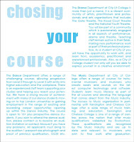
    Educational Publicity - Project: Back to the Computer

    Following the rough sketches I went back to InDesign to modify my leaflet...


    Trying to place the Courses Introduction Text.


    Happy with this, I think.


    Don't think the "dance" works that well.


    Those are over two pages, maybe too wide.


    This is now over one page, but throughout two columns and works better.


    Is the listing too wide? Maybe reduce the column width.


    First attempt at the Front Cover.


    Final snapshot.

    05 February 2010

    Educational Publicity - Project: Back to the Drawing Board

    The leaflet is now as a near completion stage, however, after printing it (which really I should have done as I went along) I realised the body text size is too big, but not just that the whole design does not really work...so I went back and did some further sketches and looked quickly through some books, mags and websites.


    Just sketching a few rough front cover.


    Trying to work out the introduction text background.


    Not quite happy with either of those.


    Still not that enthusiastic with the first one, but the second one may lead onto something I can work with...

    03 February 2010

    Educational Publicity - Project: Work In Progress

    I have just started to take the leaflet onto InDesign to work on it and this is what I have so far:

    First of all, because the size of the document is so big; I created grids and numbered the different sections. I have never worked with such a big size documents; however I am used to working with multiples pages.


    Just experimenting so far with different subjects backgrounds.


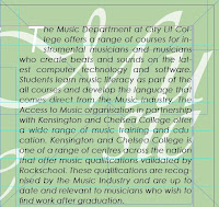
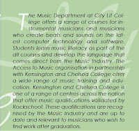
    This is the subject's introduction text; the subject is on the background; Vivaldi typeface at 30% opacity.


    This one, the text has an opacity of 70% and I think it is more legible. I am not sure yet however if it is empowering the text too much?


    I have altered the layout from "portrait" to "landscape" so I have had to rearrange a couple of things. At this stage it is not too bad to have changed the layout since there is barely anything on the page.

    Educational Publicity - Project: Folding Leaflets

    I experimented with a few different folding formats but now I need to see if their folding design makes sense...