18 January 2011

NYJC

Just started a brand new project, as part of the GDA (Graphic Design Applications).  This unit combines two project lasting  5 weeks each.  We will be formatively assessed at first then the for the summative deadline in May; we will need to produce a PDF combining all of our research and final outcomes.

NYJC - National Youth Jazz Collective requires a brand new identity from stationery to website with also a new Logo.  The final outcome should reflect the feel of the Collective: young, dynamic, enthusiasts, talented, exited.

KEYWORDS

I looked into words associated with MUSIC
  • Communication (through music)
  • Vibration, Beat, Rhthym
  • Structure of Sound
  • Production
  • Blending
  • Celebrating
Music is a passionate sequencing of thoughts and feelings such as Happiness or Vulnerability.

VISUALS 
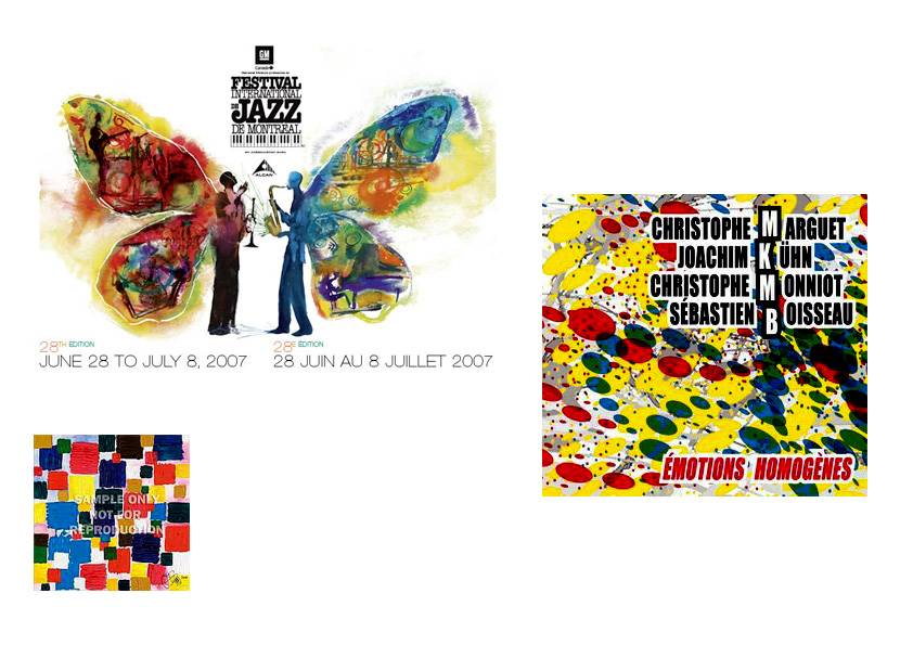


Music can be "translated" through colours


Looking at words such as Beat, Sound, Soundwave.


Combining both bright colours and sound structure.


INITIAL IDEAS


How to represent music through shapes.


Floating circles.


How can I represent the soundwaves?  The Beat?


EXPERIMENTING

Fig 1

Fig 2

Representing soundwaves through a range of medium.  
Fig 1 thread is used to replicate the soundwave.  
Fig 2 shows the use of straws


Floating cirles achieved with candle wax (blue, green and orange) 
on different colour background


05 November 2010

A to Z of Graphic Language - C

CMYK:  My initial idea is to take a picture and separate the colours to end up with a copy of Cyan, Magenta, Yellow and finally Black.

Just converted it into greyscale then saved each version as described above.

After feedback yesterday, suggesting to look at other ojects (which I will do) but my main concern is what do I do with this?

I have tried to print and copy each of them on transparent paper, which once all put on top of each other should give a different effect/ colour....
Unfortunately the transparent paper that I used did not hold the ink and it sort of "never quite dried"
I still would like to try this but first I need to find the right paper....

In the meantime I am thinking as a format,  a set of postcards (4) where the front would have the respective letter; cut out.


30 October 2010

A to Z of Graphic Language - B

I have chosen Bodycopy for my second word.

"Main text found in publications we read.  Bodycopy is the text of the stories and articles.  It is usually between 8 and 14 points in size.  Readability is the key to selecting fonts for bodycopy."

So far I am thinking of using bodycopy of newspaper cuttings, which I would use in a context other than a publication i.e. booklet, magazine, spread etc...


Text is usually found just about everywhere; although on publicity items it is usually no more than a few words or a sentence as the message needs to be understood fast; which is why I thought it may be interesting to put large amount of text on a product not initially designed for this purpose.


Other 3D formats to consider: boxes. On the inside newspaper clippings.
The outside would have the definition of bodycopy.
On the lid, I want the letters BODYCOPY to have bodycopy inside them... I know how to do it with Photoshop...but that is too easy so I will try manually and compare both results.


The process to get there was quite lengthy... but each letter holds enough text to be "passed on" as bodycopy... now how about the computerised version?


This looks much cleaner (not to mention it can be achieved very quickly!) and I guess it looks at least as good as the handmade one...could definitely do with more text.
Now about mixing them up?


I think this one with some work would probably be better than the two above.  It is the handmade version scanned in; as it is now computerised, it offers some flexibility and potential.

24 October 2010

Ampersand_Experimenting

Following some of the images online I have found; I have been experimenting with Mono Printing.
I will be doing a small square booklet; french fold - only a few pages - which will relate the experiments I have been undertaking to get to the final piece - last page.  I guess it is like the pdf we had to do for our very first project - but in a much simple, succinct way.


Gonna try and see if I could achieve a similar effect (top left) using Mono Printing.

Not quite what I was looking for - too dark and on the right I forgot one line.

Slightly better as there is less ink; the background needs to be reviewed on the right one.
The "scribbles" do not work.


Too light -  not enough ink. The right one is sort of all right although ultimately, I would love a background of a different colour.
Would it still be called Mono Printing?

This is more like I would like.  It is simply the top left picture put into Photoshop.  There are a few layers.  I want to be able to achieve this - I don't think it will matter too much if there are more than a colour but I want a this sort of background!


05 October 2010

A to Z of Graphic Language

We have been given a list of words which all begin with the letters of the alphabet.
The aim is to explore and research our chosen words and representing them through graphics.
In the first instance, we must represent all 26 words using any formats possible (3D, movies, animation, magazine, flyers and many many more); those will need to fit in a A3 box.  At the beginning of December; we will receive our first feedback and between 5 to 10 pieces will be chosen to work in much more detail.  Those will need to be handed in at the beginning of June 2011.

I have started researching some words, for the time being I am unsure if those chosen words will stay, I may have a change of art for a few of them in the next couple of weeks or so.

In the meantime, I have found this for A- Ampersand

Ampersand Typography

Going back...for a second year!

We just started back yesterday; it was great seeing everyone again after such a long break!
This year I chose to create a new blog as I thought the one from last year has quite a lot of inconsistency.
I want this one to be better from a design point of view.

We have two briefs to start with:

  • A-Z of Graphic Language
  • 'Hidden London' Book Project
They are both really exiting but extremely different.

This year we had to chose a Cross College Elective Course; I chose Writing for Design.  There was a lot of very interesting classes to chose from.  Obviously with the Blackboard sign up list, some classes got filled literally in as much time it takes to say the word! But in all I think this one will be good; I am hoping to work within the magazine/ publishing so who know those skills may come handy then.

26 May 2010

Nearly the end...

I think we must have all said it but it is so true; this year has gone by extremely quickly.


I have enjoyed it; even though I had a few lows and have been struggling.
If this year has gone that quick, I can only imagine how much quicker next year will be.
When I first applied for this course, I never thought I would do a 3rd year; then at one point during the year I thought it would be better if I did, now however I am not so sure.  
Not because I would not enjoy it or because I think it is not worth it but because I have really struggled this year.  I have so much "commitments" in my personal life that I have really felt as thought I could barely keep my head above water.
Next year will be much harder; there is a degree at the end.
If I am still struggling as much then I do not think I will apply for a 3rd year; as they say it is quality not quantity.  I do not want to hand rushed pieces of work.  I guess I will just have to wait and see.


Although, it has not always been obvious for me, I do think I have learnt; it is only now that I can actually see that I have developed ( I hope!).  
Although, when you study design, your eyes automatically attracted towards "design" (leaflet, posters, magazine...) and you become quite critical.  I have actually noticed recently that I do this much more (even pieces of design on TV!) and I am not just critical, I am processing it.


I have also enjoyed keeping a blog; it is nice to look back at what you've done throughout the year; funny how something you though was completely rubbish I am able to say it is not as bad as I thought, or something you've done you can't bear to look at it...lol!


What brought me to graphic design in the first place is magazine layout/ brochure, and I know now it is still what I want to do.  After having designed the packaged bottle for the collage extension; I looked at a lot of packaging and I must say that it is also something I would be happy to carry on experimenting.  Working 3D is very different than flat but I really did like it.


Well I think this will be one of the last entries for this year, although I will try to keep blogging and put up things that hopefully I'll be working on this summer - for myself, for my portfolio, I have a lot of unfinished business to make presentable.