Showing posts with label Workshop. Show all posts

19 May 2010

London Through the Eye of a Designer - London in Map

I really enjoyed this workshop; I love working with type.


We were each given a section of a map, then using Illustrator, we had to duplicate it with type only.

05 May 2010

London Through The Eye Of A Designer - 3D Workshop

We had quite a lot of fun, trying to build elements of London in 3D design.
It could as well be monuments/buildings or letters or a combination of both.
I chose to do London Bridge, although I simplified it a lot.
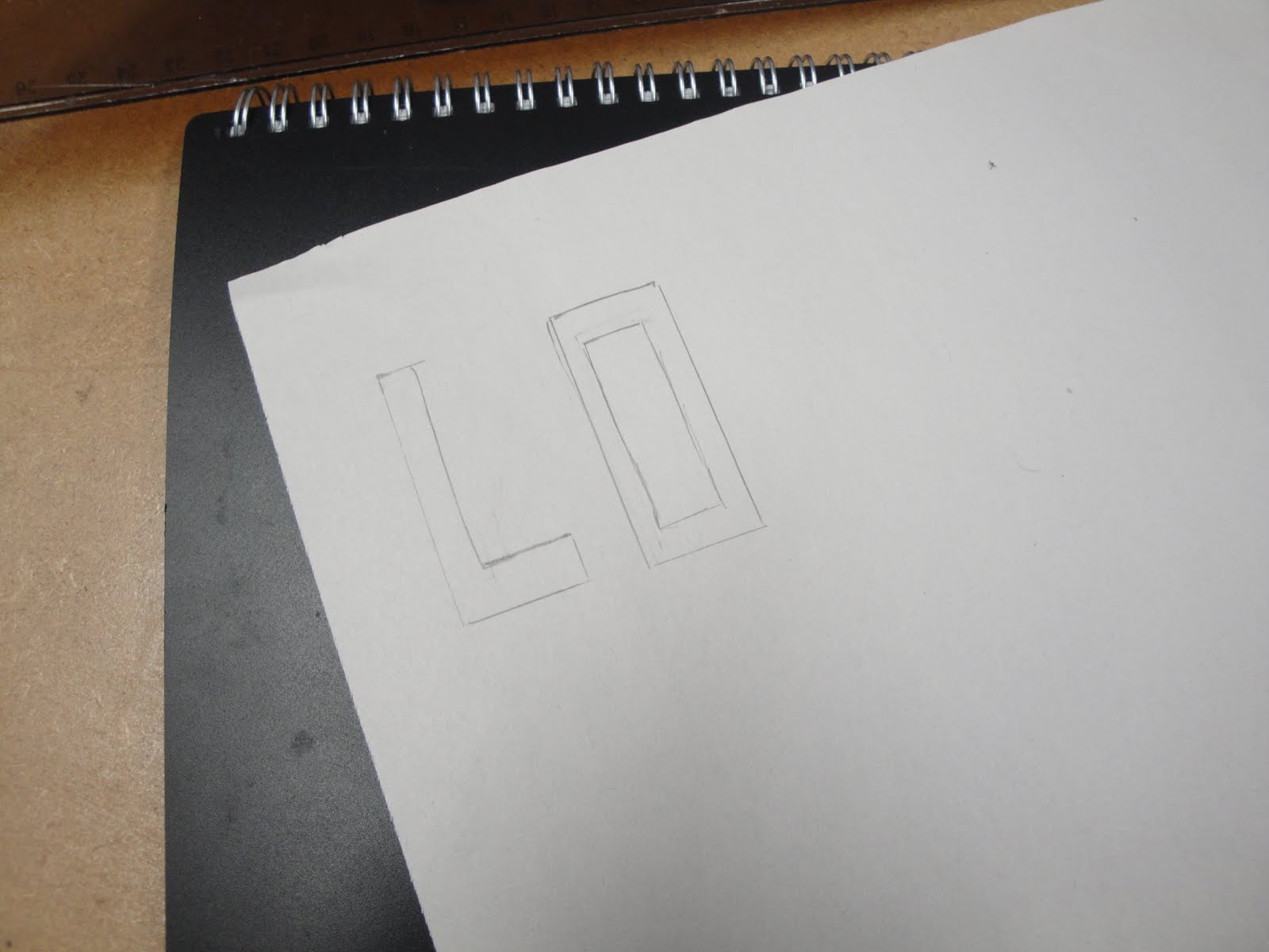
I simply drew the front of both towers, which I joined by words: London Bridge.
I did not foresee the problem I encountered with the letters, but it is nothing I can't fix.
This would be a really nice element to add to the book.
Although, this is just a prototype and I would not leave it as it is.

 Starting by just a rough sketch of the outline.


Just tracing some handrawn letters.


Which I transferred onto light cardboard.  Next time, I will draw them straight away on it.

30 April 2010

London Through The Eye Of A Designer - Icons, Symbols & Pictograms

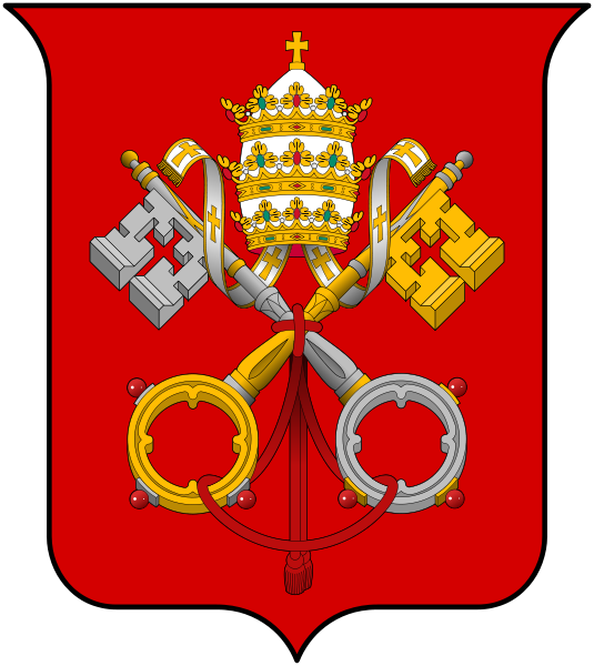
This workshop reminded me about the Isotype one.  Both were about the use of images/symbols to communicate a message. In Isotype, we made up our own 3D Isotype to communicate figures/statistics.  Icons, Symbols and Pictograms was different in the way that we had to use images/symbols to create a Crest/Coat of Arms

A few examples:


  • Bahamas


    We formed a group to create our own Coat of Arms.  Both myself and Ewa live near Askew Road.
    Askew Road, W12 is a long mainly residential road, linking Shepherds Bush to East Acton.

    This symbolises Askew Road, linking Goldhawk Road and Uxbridge Road.


    This road has a Chinese Take Away, A funeral Home, A pub called the Orchard another called Angel (hence the snake...Adam & Eve... a bit far fetched...but hey!)


    This is our final design.
    The chinese take away box has become the crest and the postcode has been made up of iconic symbols representing Askew Road.

    London Through The Eye Of A Designer - Communication and Texture

    This workshop was about describing London, using different methods.  We went through several ways such as:
    • Non - Visual
    • Non - Aural
    • Non - Verbal
    • As Time
    • As Sound
    • As Words
    • As Space
    • As Smell
    • One Word
    • As a Personality
    It is quite amazing how people perceive the same city very much different from one another.  I guess that depends on how long you have lived in London, if you were born here, if you know you are only here for a specific goal ie: studying.
    Personally, I know that my views of London have changed within time but that is most definitely because my circumstances have changed from being an Au Pair to actually living here and building a life.


    Near the end of the workshop, we had to pick a word that described London and do a collage of what it meant to us.


    29 April 2010

    London Through The Eye Of A Designer - Isotype Workshop

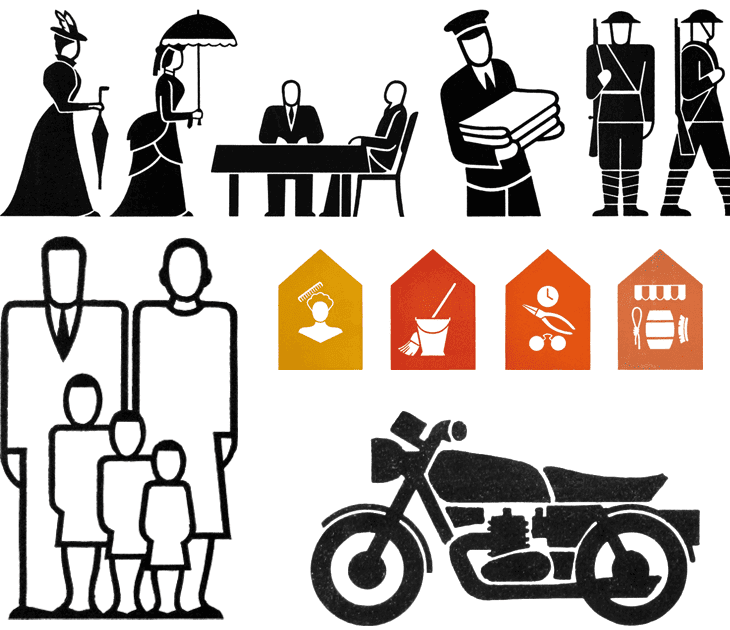
    Isotype stands for International System of TYpographic Picture Education.
    Those were first created by Otto Neurath around 1935.  They are symbol or a set of symbols representing a communication which would be understood by everyone, whether they are literate or not.  They are really developed now and can be found for many purpose.

    Here are a few examples:


    In this workshop, we were asked to create our own 3D Isotype, relating to homelessness statistic.
    We worked in a group of 3, we chose to represent our statistic using one of London's landmark, the London Eye; as it doubles up as a pie chart.


    Each colour represents a percentage


    We finalised it by putting a legend


    An example of another group's 3D Isotype
    Hmm, Yummy Jelly Beans!

    London Through The Eye Of A Designer - Contrast Workshop

    This was about highlighting the many differences London has to offer.
    We were given opposite paired words ie: black/white, long/short, smooth/rough, transparent/opaque...
    The aim of the workshop was to create a little booklet which would sort of tell a story using 1 or 2 words.
    We worked in pair; I chose transparent/opaque and Amna had smooth/rough.
    We went around the college and starting taking pictures; I was quite amazed how much texture is out there.  It was nice to actually have the opportunity to take the time to notice it.

    The booklet could only have black and white pictures, using the crop tool only as well as contrast adjustment.

     An example of rough texture


    and smooth


    This shot was taken through a window; the thing with transparancy is that everything behind it is at full opacity.


    Our booklet, combination of Rough/Smooth and Transparent/Opaque


    A few sample of what the rest of the group did

    London Through The Eye Of A Designer - Mono Print Workshop

    This workshop was really fun and easy...really does what it says on the tin: quick efficient way to make a black and white picture/design.

    The process is very easy and surprisingly not too messy; bonus: the ink is waterbased...
    For the purpose of our books; we worked on A5 portrait size.

    First of all, the plate needs to be prepared by taping a frame around so that once you start inking, you are sure to have a "clean" border, although it does not necessary have to be straight.


    The ink needs to first be spread in order to get an even coating (or as even as possible).  Too much ink or uneven coating can lead to unforseen outcome...all part of experimenting...


    01 March 2010

    Workshops - Book Binding

    This workshop was great fun to do, not to mention very handy to know.  I made a book last year for one of my projects and I had no idea how to bind it...now I can!


    The workshop covered two ways to bind, firstly by stitching (which was surprisingly easy - especially since sewing is not one of my strengths...) and by using the binding machine.  It is basically gluing pages.


    First of all, we put together 10 pages, which we subsequently folded.


    Once all the pages were stitched together, we put the covers.


    The cover will need to be trimmed to size.


    Nearly ready to go!

    21 February 2010

    Workshops - IT - Helvetica Remixed

    Last Tuesday, as part of an IT Workshop, we had to "remix" Helvetica using Illustrator. My letter was "w". The session was 21/2 hours at the end of which our letter was to be given to Jo. She compiled all of the letters and made a book out of it, published on Isuu.

    I just saw it today and it is pretty good...although mine, not sure exactly what happened but it is not exactly as I had given it to Jo...did I give her the wrong version...possibly. Hopefully, if it isn't too much hassle for her she will be able to change it...pretty please...!

    Anyway, this is what I did...


    I have really enjoyed doing this and definitely carry on experimenting...
    That was fun and I am sure this skill will prove very useful in the future. Thanks Jo. Looking foward to more workshop with you although I know I should not just rely on the college, I need to experiment and learn of my own initiative.