I just started to put things together for my research book; I struggled a lot at first, there are a lot of pictures of all different sizes and shapes which makes it quite awkward. I think were I went wrong is because I took it for granted that I could just put stuff in and sort of arranging around as I went along but that clearly did not work.
Those spreads look all over the place; but although I had a grid I still struggled with the captions, quotes, text...
I spent a bit of time designing the grid; as well as master pages for chapters. I need to figure out how to put 2 page numbers in one page; I'm afraid so far I've been unsuccessful.
25 May 2010
19 May 2010
London Through the Eye of a Designer - London in Map
I really enjoyed this workshop; I love working with type.
We were each given a section of a map, then using Illustrator, we had to duplicate it with type only.
13 May 2010
Ooops - Didn't mean to do that but turned out great anyway
I was just working on a photos, actually quite a few, this is why I was using shortcuts; I typed this (thinking it would brink the image size box) but it gave me a nice unexpected effect instead...now I just need to find out what it is...!
Ctrl+I
From this
To This
I know what it is now, it's invert...
Interesting use of Typography
I saw those design a little while ago
On both those pieces, I like how the type is very much part of the design as opposed to being informative.
Out of London
I went away for the Bank Holiday Weekend; was really lovely to get away from the madness than London can be at times...
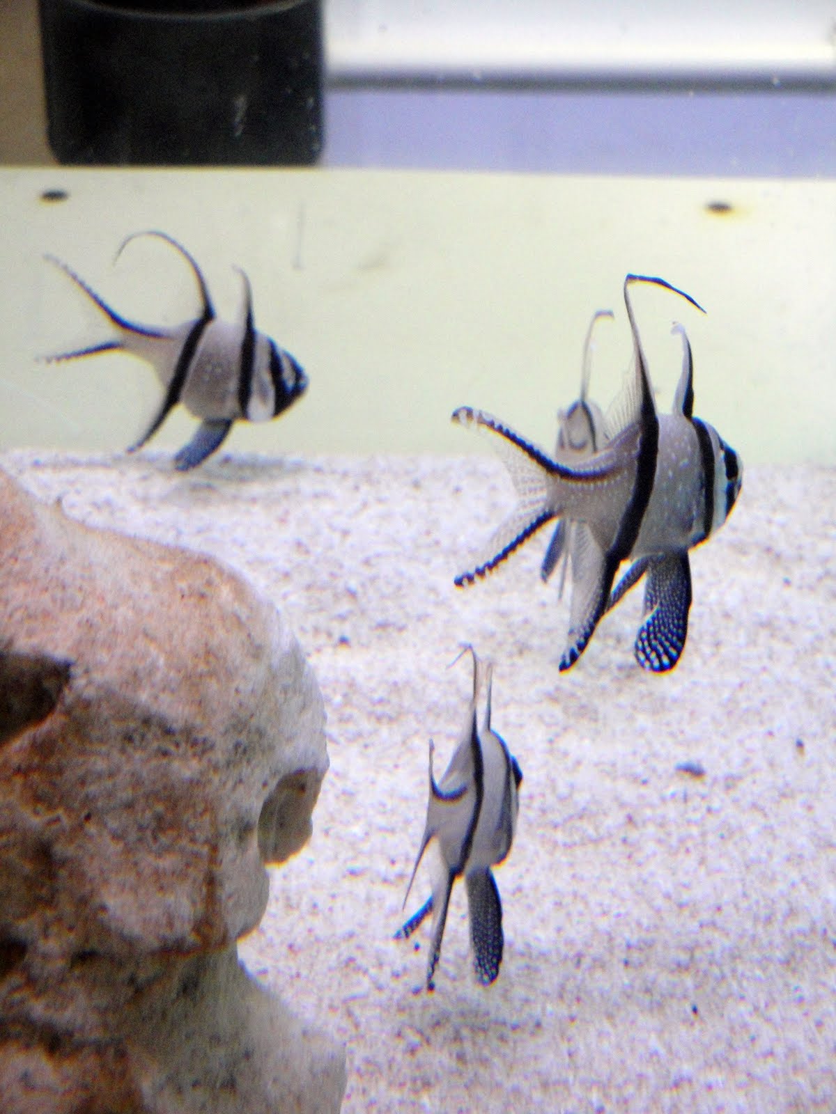
I visited an aquarium there (well the visit only took half an hour but hey...!) and was really quite amazed by how much colours and shapes natures has to offer, in this instance the sea/ocean. There were some really amazing fishes, some little "Nemos" and some little "Daureen". I must say it is really hard to take a picture of a fish: they don't stop moving!. I saw baby sharks too but the pictures did not come good. As I said some really beautiful ones but unfortunately some not so lucky in the "look department"Just a normal fish...
Quite amazing
Playing hide and seek...
Those are so cute
Hmm quite scary and a bit ugly...poor thing!
Beautiful shapes and colours
06 May 2010
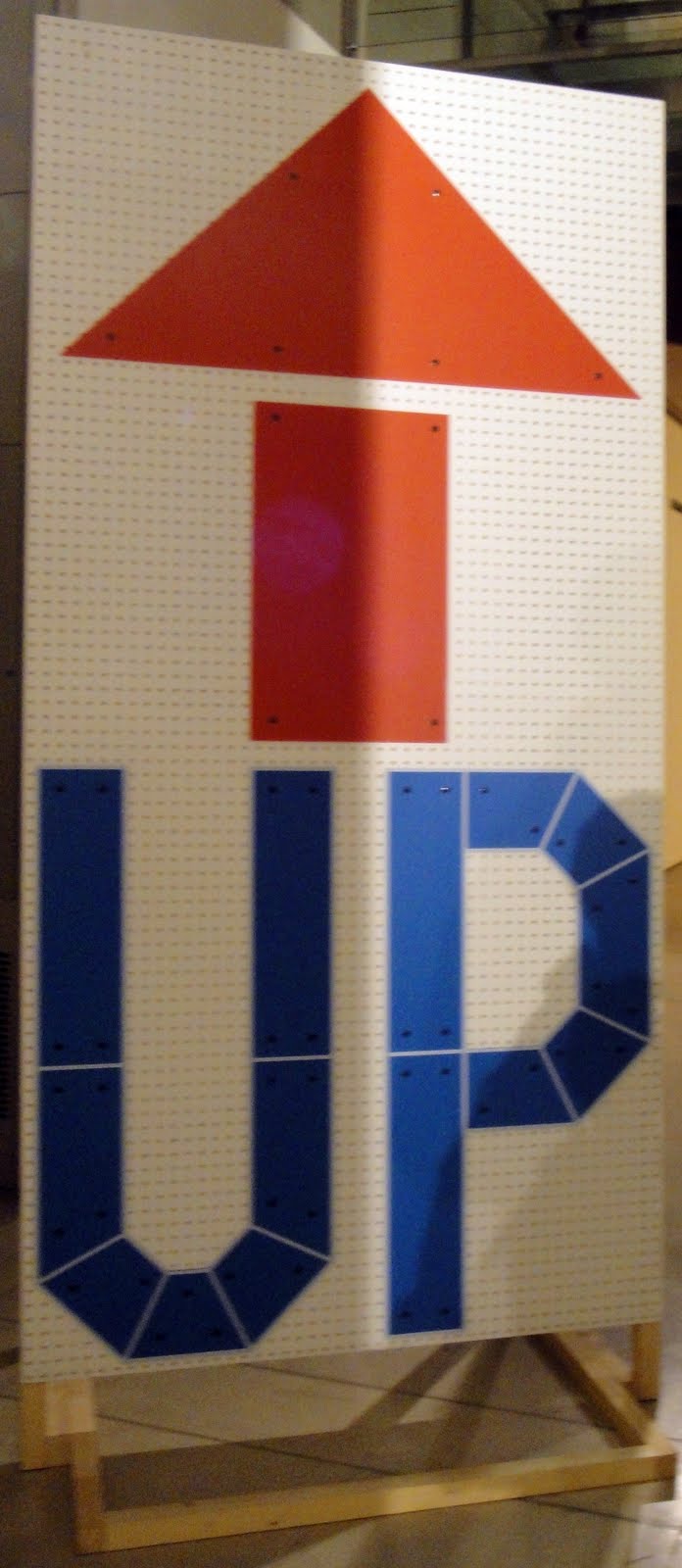
Visit to Pick Me Up Gallery
The Gallery located near between Coven Garden in the Somerset House.
There was a lot of work on display. 05 May 2010
London Through The Eye Of A Designer - 3D Workshop
We had quite a lot of fun, trying to build elements of London in 3D design.
It could as well be monuments/buildings or letters or a combination of both.
I chose to do London Bridge, although I simplified it a lot.
I simply drew the front of both towers, which I joined by words: London Bridge.
I did not foresee the problem I encountered with the letters, but it is nothing I can't fix.
This would be a really nice element to add to the book.
Although, this is just a prototype and I would not leave it as it is.
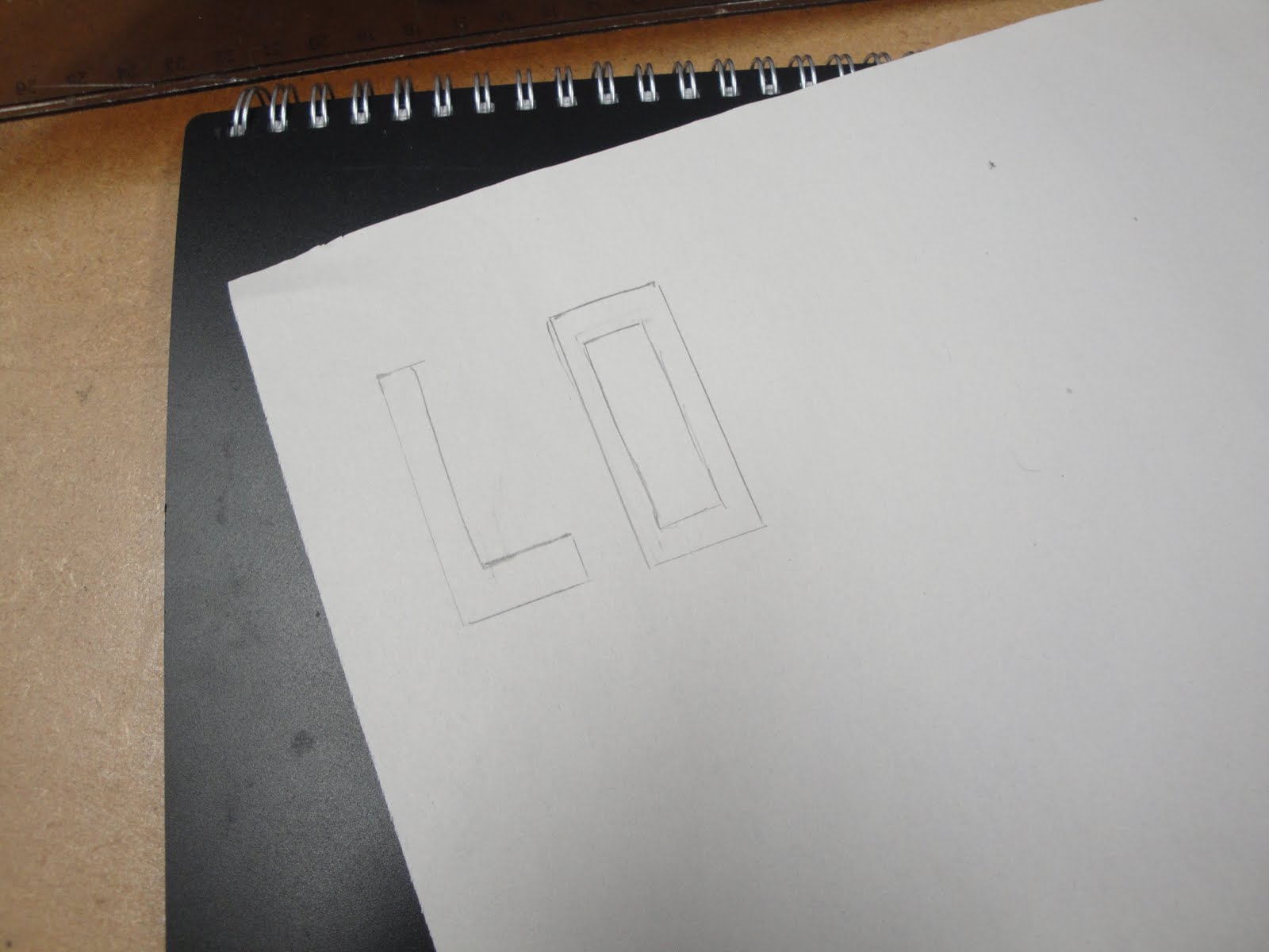
Starting by just a rough sketch of the outline.
Just tracing some handrawn letters.
Which I transferred onto light cardboard. Next time, I will draw them straight away on it.
Subscribe to:
Posts (Atom)